The frustration of being a fan of Apple products when you’re not a fan of analog clocks.
Intro
Before I begin I want to stress that this is not intended to be a rant. While it is coming from a place of years of frustration, I love Apple products. I love them so much I made writing apps for them one of my main hobbies. My hope for this post is to make Apple products better for all of their users.
Starting Point
As a US based user what do I see if I look at the lock screen of an iPhone or an iPad?
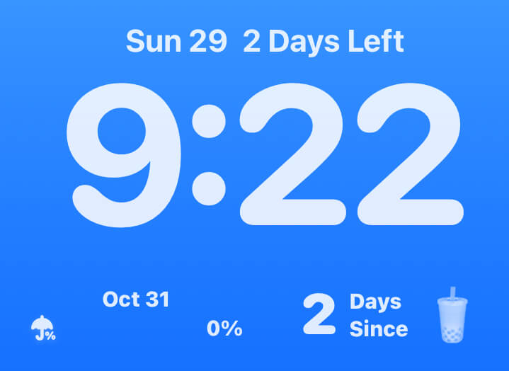
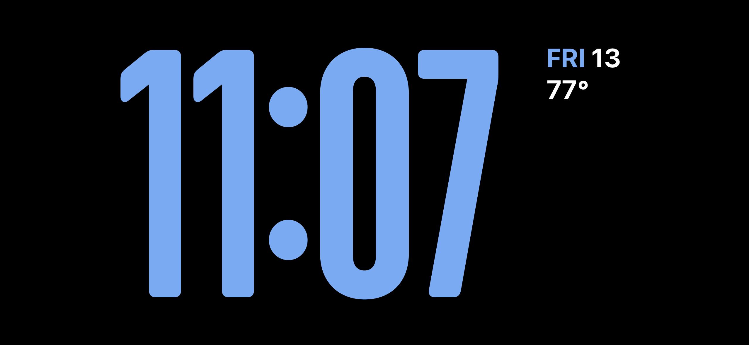
The time is presented in a digital format, horizontally, with large numbers. Useful information is displayed above and below the time via widgets. Even better, we now have the ability to adjust that digital time by changing fonts, colors, etc. Love it! And what if you would prefer that the time would be displayed like this whenever possible? Well with the current state of things that means a lot of frustration.
Let’s get specific with some examples.
StandBy
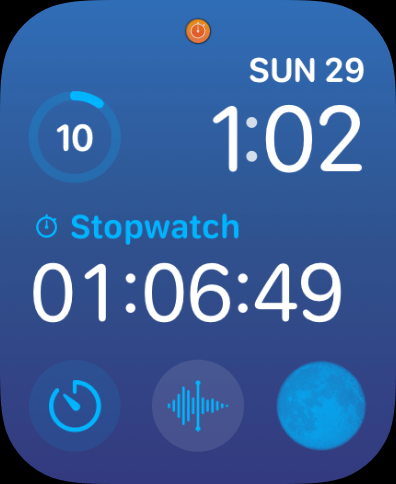
StandBy is in the running for my favorite addition to iOS 17. I absolutely love it and it’s the perfect bedside clock for me. If you’re using just the clock then there are several digital clock faces to choose from. This one is my personal favorite.
What makes StandBy even better is that you can have a widget on the left and right side of the screen. I was testing a widget for Please Don’t Rain and assumed that I would just put a similar, smaller version of my digital clock on the right side. Well, that’s not possible. While there are seven analog clock choices for small Clock app widgets with StandyBy there is not a single digital clock choice.
Edit: Oct 28, 2023
A small clock widget that shows the current time in digital format is in the beta for iOS 17.2. That means a fix for this shortcoming of StandBy is coming soon.
Clock Widgets
When you bring up the World Clock tab in the iOS Clock app you can have it show you a list of times in a digital format, just like I would want it to.
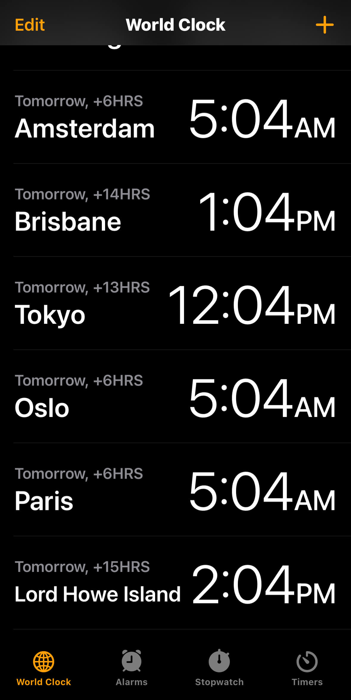
I wanted to track the time in another country so I thought it would be nice to set up a Clock widget to do so. Obviously you can get a widget that displays multiple time zones like this, right? No, you can only use analog clocks to track multiple time zones with a widget.
Apple Watch
Oh boy here we go. This is what pushed me over the edge and motivated me to write this. Nothing has caused me more frustration on this topic than Apple Watch faces. The majority of Apple Watch faces are analog clocks. We’re eight years into the existence of the Apple Watch and I still don’t have the watch face that I want. What face am I looking for? Well, I’d like the time presented in the center in a digital format, horizontally, with large numbers and useful information displayed above and below the time via complications. Sound familiar?
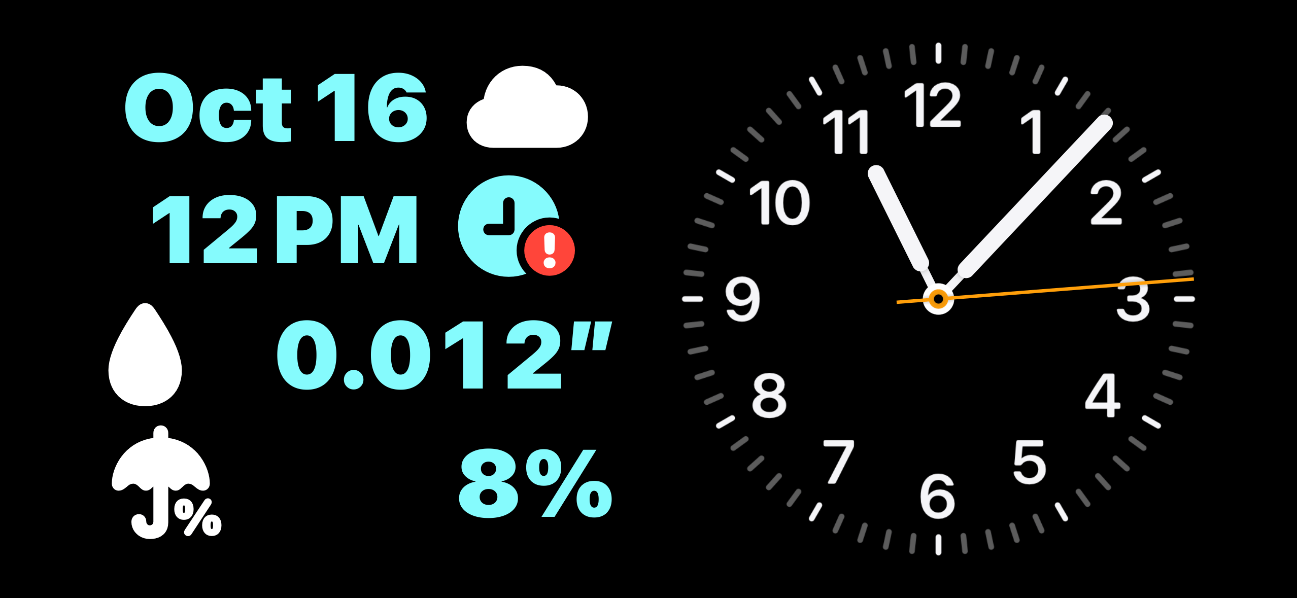
The Modular face is close to what I want but it falls short because of the time.
I don’t want a giant complication in the center of the screen. I want the time to be the focal point of my timekeeping device, which means I want it in the center of the screen, displayed horizontally.
A New Watch Face Emerges
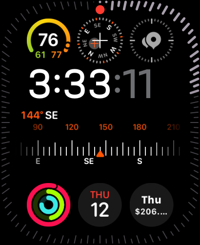
Imagine my excitement when I saw news of this new face that was coming with watchOS 10. (Thanks to Tyler Hillsman for the screen grab.) This is obviously an Apple Watch Ultra, but look how this Modular Ultra face is constructed. Take away the outer data ring and the large compass complication in the center and you’ve got the Apple Watch face that I’ve always wanted. The face can also be configured so that the digital time takes up all the space in the center instead of having two large complications. Excitement turned to disbelief and more frustration when I learned that a version of this watch face would not be coming to regular Apple Watches.
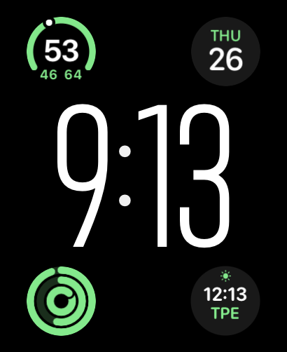
You could be thinking, “Maybe it’s a technical limitation? That’s a lot of complications!” But this alternate configuration from Tom Cook shows that a version with less complications than the Modular watch face is possible. Shrink that giant font used for the time and you’ve got a watch face for the regular Apple Watch.
If this was an omission then I hope that in the future a similar face would be made for the regular Apple Watch. If making this face exclusive to the Apple Watch Ultra was done to drive sales then I would hope that this decision would be reconsidered. While I appreciate how nice the Apple Watch Ultra is I don’t need one and I don’t want one. There are so many things that make the Apple Watch Ultra great such as the screen size, the screen quality, the low light capabilities, the action button, the durability, the battery life, etc etc. Why not advocate for the Apple Watch Ultra with all of those? Why take something away from your other users? Spending hundreds of dollars on a new Apple Watch Series 9 and not being able to access a watch face that exists, but I can’t have just puts such a bad taste in my mouth.
Bizarrely you are able to configure small complications on digital watch faces to show the current time, but you cannot do this with large complications. Having the time displayed twice obviously isn’t ideal, but configuring the large complication that way on the Modular face would allow me to get the time in the center like the Modular Ultra face I can’t use as a Series 9 owner. I filed feedback FB13320294 with Apple about this.
What Watch Faces Do We Have?
So what’s the state of watch faces for regular Apple Watch users? Honestly, it’s not great if you’re like me and don’t like analog clocks. That immediately eliminates the majority of watch faces. Let’s break it down. In 2023 we got four new watch faces, with three of those being analog. The only new digital face is Nike Globe, which is not one that I would choose to wear.
| Face | Analog | Digital | Comment |
|---|---|---|---|
| Activity | 1 | 1 | Time isn’t in the center and I don’t need all that activity data always present. |
| Artists | 0 | 2 | No complications and time not horizontally in the center. |
| Astronomy | 0 | 1 | Minimal complications and time not horizontally in the center. |
| Breathe | 1 | 0 | |
| California | 1 | 0 | |
| Chronograph | 1 | 0 | |
| Chronograph Pro | 1 | 0 | |
| Color | 1 | 0 | |
| Contour | 1 | 0 | |
| Count Up | 1 | 0 | |
| Fire and Water | 1 | 0 | |
| GMT | 1 | 0 | |
| Gradient | 1 | 0 | |
| Infograph | 1 | 0 | |
| Kaleidoscope | 1 | 0 | |
| Liquid Metal | 1 | 0 | |
| Lunar | 1 | 1 | Time is in the center, but you still have analog complications. |
| Memoji | 0 | 1 | Minimal complications and time not in the center. |
| Meridian | 1 | 0 | |
| Metropolitan | 1 | 0 | |
| Mickey & Minnie | 2 | 0 | |
| Modular | 0 | 1 | Time not in the center. |
| Modular Compact | 1 | 1 | Time not in the center. |
| Modular Duo | 0 | 1 | Time not in the center. |
| Motion | 0 | 1 | Minimal complications and time not in the center. |
| Nike Analog | 1 | 0 | |
| Nike Bounce | 0 | 1 | No complications and time displayed vertically. |
| Nike Compact | 1 | 1 | Time not in the center and displayed vertically. |
| Nike Digital | 0 | 1 | Time displayed vertically. |
| Nike Globe | 0 | 1 | Time displayed vertically. |
| Nike Hybrid | 1 | 1 | Time displayed vertically. |
| Numerals | 1 | 0 | |
| Numerals Duo | 0 | 1 | No complications and time displayed vertically. |
| Numerals Mono | 1 | 0 | |
| Palette | 1 | 0 | |
| Photos | 0 | 1 | Time not in the center. |
| Portraits | 0 | 1 | Time not in the center. |
| Pride | 3 | 2 | Time not in the center and/or displayed vertically. |
| Simple | 1 | 0 | Why is there a simple analog but not simple digital? |
| Siri | 0 | 1 | Time not in the center. |
| Snoopy | 1 | 0 | Even though I don’t like analog clocks, this one is pretty great. |
| Solar | 1 | 1 | Minimal complications and time not in the center. |
| Solar Analog | 1 | 0 | |
| Stripes | 1 | 0 | |
| Timelapse | 0 | 1 | Minimal complications and time not in the center. |
| Toy Story | 0 | 1 | Minimal complications and time not in the center. |
| Typograph | 1 | 0 | |
| Unity | 2 | 1 | Time displayed vertically. |
| Utility | 1 | 0 | |
| Vapor | 1 | 0 | |
| World Time | 1 | 1 | Time is in the center, but you still have analog complications. |
| X-Large | 0 | 1 | With no complications the time is displayed vertically. If you enable the one complication it allows then the time is not in the center. |
If you remove analog watch faces then you remove the majority of that table. Remove where the time is displayed vertically and another big chunk is gone. Get rid of the time that’s not in the center and you’re left with just Lunar and World Time. Remove the watch faces with analog complications and you’re left with nothing.
Nike Globe
Nike Globe is the only digital face added this year. But the description states that it “combines digital and analog timekeeping”, so I feel that the argument could be made that we didn’t get any fully digital watch faces this year for the regular Apple Watch.
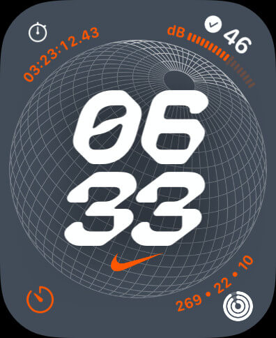
Things that would make me not pick this watch face:
- The time is displayed vertically.
- The font for the time.
- The leading zero in the time.
- Analog complications.
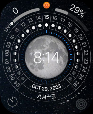
Lunar and World Time
While it’s nice that the Lunar and World Time watch faces let you change from an analog clock to the digital time, you still have the analog version of the complications and a giant ring of data that I don’t need. The time is somewhat small and when there’s a full moon it’s hard to read on the Lunar watch face. These faces default to analog and certainly don’t feel like they were designed with the digital time as the focus.
Not A Problem With Competitors
The sad thing is that with other digital watch face makers I am overwhelmed with choices that I would like and would have trouble picking one.
Garmin and Pebble are examples of where I would have too many faces I like to choose from where and with my Apple Watch I have zero.
Garmin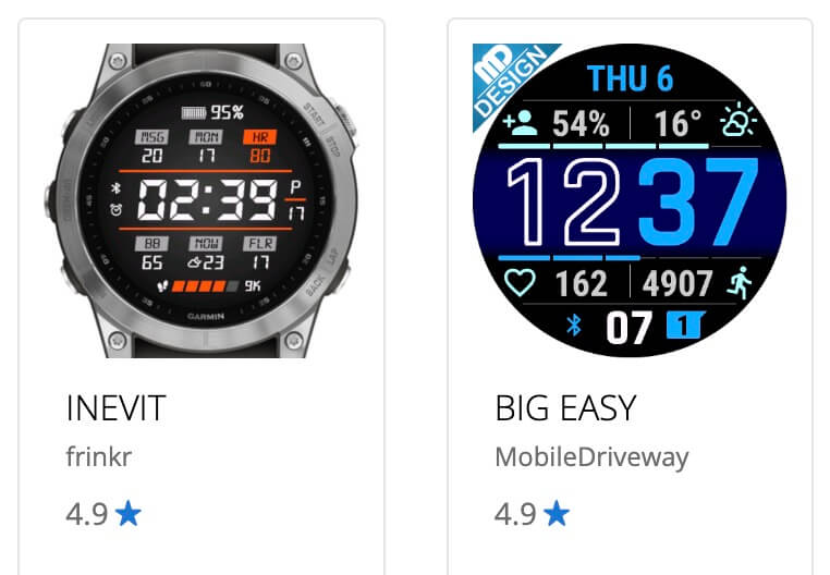
Pebble
New Pebble 2 Duos are arriving and the subreddit keeps asking to compare them to old Pebble 2...
— Eric Migicovsky (@ericmigi.com) October 14, 2025 at 1:26 PM
[image or embed]
I would commit crimes to get this watch face on my Apple Watch.
thrilled to have a #pebble on my wrist again, thank u @ericmigi.com + everyone else responsible for resurrecting this beautiful timepiece.
#pebblewatch #pebble2
— Jack Kaiser (@derkaiser.bsky.social) October 28, 2025 at 4:22 PM
[image or embed]
Maybe Next Year
Every year I hope this will get better and it never does. Here’s the feedback I filed with Apple in June 2023 when I didn’t know the Modular Ultra face was coming.

Maybe this will change next year? I say that every year and one year hopefully it will come true.
Footnote
This blog post ended up getting a lot of attention on Mastodon. Thanks to everyone who liked and boosted it. I received a good deal of comments from people that have felt the same frustration for years. They’re definitely worth reading.