Tips to make your app more accessible.
Intro
If you’re unfamiliar with AppleVis here’s a little about them:
AppleVis is the go-to online resource for blind and low vision users of Apple products such as the Mac, iPhone, iPad, Apple Watch, and Apple TV. Our mission is to empower people by providing information on accessibility features, accessible apps, and workarounds, as well as fostering a community of support and sharing of knowledge.
Each year they give out awards they call Golden Apples:
Launched in 2012, the AppleVis Golden Apples is an opportunity for blind and low vision users of Apple products to recognize and acknowledge the hard work and dedication which developers have put into making and maintaining great and accessible applications during the given year.
It doesn’t feel like that long ago when in 2022 I told Christian Selig (and inadvertently Klemens Strasser) that they were nominated.
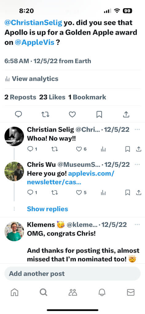
It didn’t even cross my mind that the app I was developing would get me nominated a year later.
You’re Nominated!
One morning last December I woke up and checked my email. I started reading an email from AppleVis about 2023’s nominees. The first one listed was Be My Eyes, a great app with a huge audience that I love volunteering for. I almost dropped my iPhone when I saw that my app, Please Don’t Rain, was also one of the nominees.
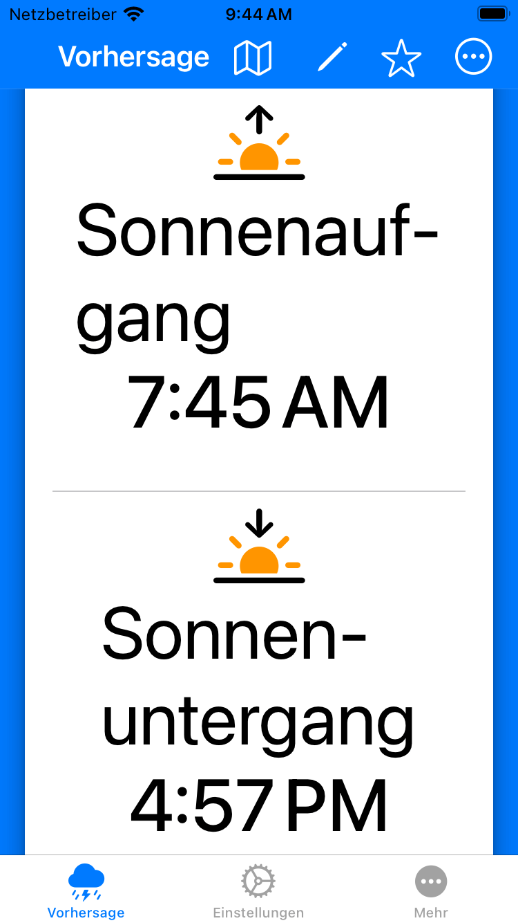
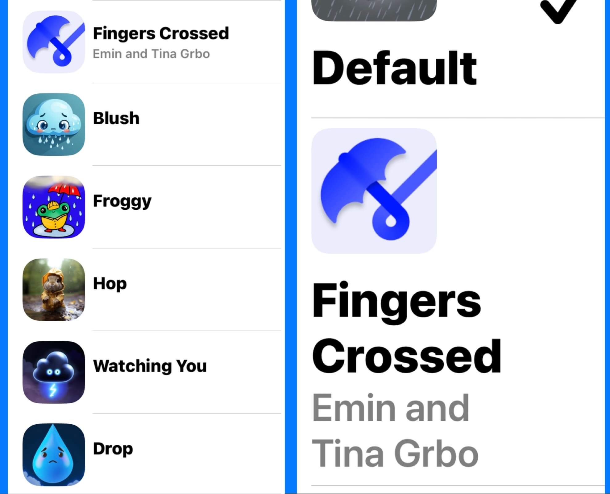
Please Don’t Rain makes tracking upcoming weather easy by letting users designate an important date and location to automatically receive precipitation forecasts. The app displays beautiful weather imagery that updates along with conditions. Please Don’t Rain Pro unlocks real-time forecast updates, temperature and UV charts, statistics, widgets, themes, maps integration, and custom icons. The accessibility-focused app also comes in a free ad-free version with hourly precipitation charts.
I swear that this made my month, if not year!
How?
I’ve had a couple people asking me what I did or what I focused on to get nominated. While I don’t know the answer to that, I can tell you I’ve done to make my apps more accessible. Hopefully some of these tips will help you do the same with your apps!
I’m almost certainly missing some things and this isn’t meant to be an in-depth tutorial on how to implement each one. Hopefully it’s enough to help find some omissions that might be in your accessibility support.
Also, I’m definitely not trying to pass myself off as an expert in accessibility. I just love learning and making my apps more accessible.
I’m writing this from the viewpoint of someone that normally focuses completely on SwiftUI.
Large Text
Once you start looking it’s appalling how often you can find apps not properly supporting large accessibility text sizes. I’m not throwing stones because I used to be one of them. This is what started my drive to make my apps as accessible as I can. One day I was watching my mom use my first app, Museum Shuffle, and was horrified to see that one of my Views was completely broken. My mom uses large accessibility text sizes and my View that was supposed to show artwork and its accompanying text was only showing a large version of the artwork. The large text had broken my constraints that I had in place. After that I vowed to do better.
Getting your UI looking the way you want it to is one thing, but then making sure it also works with the smallest screens with the largest text can be quite a challenge. My initial goal is getting the largest accessibility text size, the smallest iPhone (SE), and German working together. Once that’s taken care of most of the difficult work is already done.
Here’s a couple of things that help me achieve that:
AnyLayout
An easy way to make more room for your large text is to just display things vertically instead of horizontally. With SwiftUI I used to have to enclose things in a Group and then wrap that Group in an HStack or VStack depending on the text size in use. Now we have “AnyLayout” that makes things so much easier. I have code such as this all over the place:
@Environment(\.dynamicTypeSize) var dynamicTypeSize

let layout = dynamicTypeSize.isAccessibilitySize ?
                      AnyLayout(VStackLayout(alignment: .leading)) :
                      AnyLayout(HStackLayout())

layout {
   Text("Pineapple Pizza")
   Text("So Gross")
}
This lets your UI adjust nicely to be able to display more large text without necessarily having it be hyphenated.
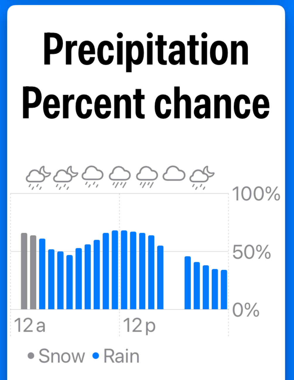
Limit Growth
While it would be nice if we could show the largest text size everywhere, that’s unfortunately not the case. SwiftUI lets us specify how large text can get for a View. I would normally have the max as a constant but used the actual value here for this example.
.dynamicTypeSize(...DynamicTypeSize.accessibility2)
I use this to control the text size for the axis labels on my charts, which would become hard to read when too much text is tried to be put into a space that can’t fit it all.
Notice how the header text is much larger than the text on each chart axis.
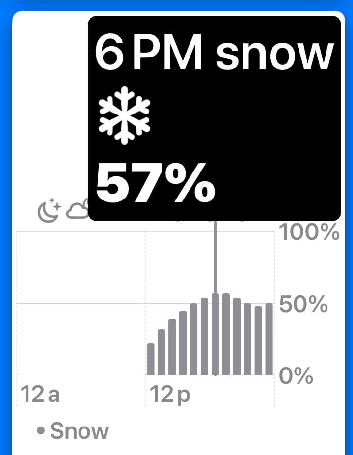
iOS 17 gave us the ability to add RuleMarks to charts. Even though I’m limiting the text size inside the chart for readability, that’s not the case for my RuleMark popover. This lets the user seeing details in a size that might be more readable for them if they’re using larger text sizes.
Audio Graphs
Besides standard labels and hints something else you can do to improve your charts is add support for Audio Graphs. This is honestly something I never would have figured out how to do on my own. I followed this guide by Majid Jabrayilov. As a funny side note, I had no idea what an Audio Graph was and assumed it was just the labels and values all read out at once. I was completely bewildered the first time I played one and started hearing different tones. 😂
VoiceOver
Besides the standard hints, labels, and values there are other ways that you can help VoiceOver users.
Traits
Traits are a great thing to add. Do you have parts of your UI where you react to a tap gesture? Then indicate that it’s a button.
.accessibilityAddTraits(.isButton)
You can also indicate that something is a header. I never realized how important this was until I spoke with Ed Worrell, who has been a great help with testing and helping me implement VoiceOver functionality. I was worried that when large text sizes were in use that users that just wanted to see charts had to scroll through too much of the forecast data to get to them. So I added a “Go To Charts” button to help with that.
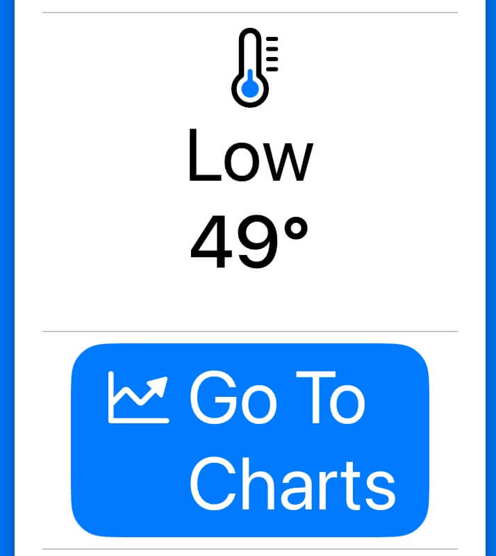
Ed mentioned that he wouldn’t have need for that button as a VoiceOver user because I had done a good job at marking the beginnings of my sections with headers. He could just quickly change to different sections by moving between headers (you can select a rotor action that jumps to headers). I tried this myself and it completely changed how I use VoiceOver for testing.
This takes such little effort and can make such a big difference!
.accessibilityAddTraits(.isHeader)
Combine
Combining elements together can make it much less tedious to navigate your UI.
.accessibilityElement(children: .combine)
Decorative
Marking decorative images means that VoiceOver users won’t have to deal with navigating around them.
Image(decorative: )
VoiceOver Problems
I’m not going to sugar coat this. Sometimes it is painful trying to implement VoiceOver support with SwiftUI. I spend so much time trying to figure out why VoiceOver isn’t working the way I expected and then having to find ways around the problem.
Things are fine when you’re using very basic layouts with HStack and VStack, but once you start adding a little complexity then you might be in trouble. What’s frustrating is that it doesn’t take much to get to this point. Some Grids, LabeledContent, or LabeledContentStyles are an example of where this can start.
To illustrate this here’s the open Feedback items I current have relating to VoiceOver. I’m not even listing the ones that I spent time on that were fixed and closed. (Thank you Apple for addressing those, by the way.)
| Feedback ID | Title | Comment |
|---|---|---|
| FB13632137 | onTapGesture does not work on a GridRow if a column contains Text("") | VoiceOver does not activate the code in onTapGesture if it’s for a GridRow that contains a column that uses Text("") to indicate an empty column. |
| FB13555954 | VoiceOver completely ignores SF Symbols if a chart has enough data. | It will read symbols if there is a small amount of data, but when VoiceOver has to group entries together it ignores symbols. |
| FB13517395 | VoiceOver text is not read in SwiftUI Menus | Hints and labels are completely ignored. |
| FB13373795 | .invalidatableContent() causes VoiceOver problems in widgets | Any items that make use of .invalidatableContent() cause the VoiceOver bounding box to get pushed to the top of the widget. |
| FB13221109 | There are scenarios where a shortcut’s custom View is ignored by VoiceOver | The contents of a shortcut can be completely ignored if the shortcut isn’t run from the shortcuts app. |
| FB12436802 | Unexpected behavior with LabeledContent and VoiceOver | The label can be read twice. |
| FB12105619 | VoiceOver Zoe reads 0.03 as “zero dot three” | |
| FB12037246 | VoiceOver will use a description not related to weather for one weather condition | An SF Symbol for weather usually provides a useful description of the weather symbol, such as “Scattered Showers”. However, if it is a clear day the symbol returned is “sun.max” and VoiceOver reads that as “Brightness Higher”. |
| FB12677180 | VoiceOver will not read the hint for a Picker with segmented style | It actually won’t read accessibilityValue entries either. |
| FB12194455 | SwiftUI buttons inside of a Menu do not have their VoiceOver hint read | |
| FB11577056 | A VoiceOver voice (Zoe) is sometimes reading the time incorrectly | It can say “eleven thirty one pm” but then a minute later say “eleven minutes and thirty two seconds pm”. It can also stay in the incorrect state several minutes in a row. |
| FB11441750 | SwiftUI GridRow items can’t be combined for VoiceOver support |
accessibilityRepresentation
If you end up constructing a custom UI element that would be quite challenging for some of your users to use you can actually completely replace it from an accessibility standpoint with an accessibilityRepresentation.
But there’s also another interesting use case for this. Above | mentioned an issue where VoiceOver will not read the hint for a Picker with segmented style. Well I got around that by providing an accessibilityRepresentation without the segmented style.
Picker("Chart Type", selection: $hourlyChartChoice) {
    ForEach(HourlyChartType.allCases, id:\.self) { oneCase in
        Image(systemName: oneCase.symbol.rawValue)
            //.foregroundColor(.primary)
            //.accessibilityLabel(Text(oneCase.VO)) // yes
            //.accessibilityValue(Text("\(oneCase.symbol.rawValue)")) // no
            .tag(oneCase.rawValue)
    }
    //.accessibilityHint(Text("Choose what type of chart to display.")) // no
}
.pickerStyle(.segmented)
.accessibilityRepresentation {
    Picker("Chart Type", selection: $hourlyChartChoice) {
        ForEach(HourlyChartType.allCases, id:\.self) { oneCase in
            Text(oneCase.VO)
            //.accessibilityLabel(Text(oneCase.VO)) // yes
            //.accessibilityValue(Text("i found \(oneCase.symbol.rawValue)")) // yes
                .tag(oneCase.rawValue)
        }
        .accessibilityHint(Text("Choose what type of precipitation chart to display.")) // yes
    }
}
Obviously it’s not ideal to have to do this for standard UI elements, but I’m glad that this workaround is available. After receiving negative feedback from more than one VoiceOver user I also did the same thing and replaced the contents of a Grid with an accessibilityRepresentation with simple HStack and VStack entries.
accessibilityElement
In Jan 2023 I opened FB11969305 because “VoiceOver ignored .accessibilityHint and accessibilityLabel if they were attached to a SwiftUI ColorPicker.” This is NOT a problem currently and has been fixed. But at the time I got around it with this workaround with .accessibilityElement():
VStack {
  ColorPicker("Color Stuff", selection: $theColor, supportsOpacity: false)
}
.accessibilityElement()
.accessibilityHint(Text("Change the color of the message"))
.accessibilityAddTraits(.isButton)
Colors
I used to default to the app having a gradient blend of two colors I found appealing. However an Xcode accessibility audit reported that the contrast was not high enough for reading text. I switched my background color to be a single color that passed an audit but still gave users the ability to blend any two colors they wanted.
In the colors for my charts I also figure that I’d never be able to pick colors that were easiest for all colorblind variations so I let the user change the chart colors to whatever they want.
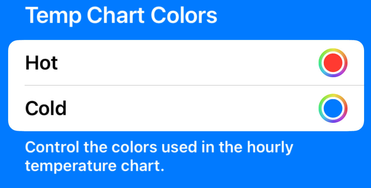
Of course symbols are also of great use at differentiating things instead of or in addition to color.
Voice Control
I really appreciated this blog post from Paul Hudson entitled, I screwed up one key accessibility behavior, and now I’m on a mission to do better, because I had done the same thing.
It’s simple to add better support for Voice Control:
.accessibilityInputLabels(["Place", "City", "Location"])
I’ve become a huge fan a Voice Control. I only use VoiceOver when I’m testing my app but I’ve started using Voice Control occasionally. It’s incredibly handy in some situations.
WWDC labs
An absolutely wonderful opportunity exists every June in the form of accessibility labs during Apple’s WWDC conference. You’ll get feedback from Apple engineers and product specialists on how to improve your app. I wrote a blog post about my first one. One of the Apple people told me that he has low visibility and that I had some the best large text work he’s seen in a while. That was so fulfilling to hear that!
One of the best tips I got from another accessibility lab about Please Don’t Rain was that they spotted that I didn’t do a good job with supporting the VoiceOver Item Chooser on one View. Underneath a person I would link to their website or socials and it was clear what that link was tied to them. That wasn’t the case when you went into the Item Chooser.
I didn’t even know that the Item Chooser existed before the lab and I was able to make a change because of this.
AppleVis
Last but not least, AppleVis is another way that I’ve made my app better. I’ve gotten some excellent feedback from friendly users when I’ve posted asking for feedback on my apps.
Please note that while AppleVis has a directory where you can “see what apps others are recommending”, as a developer you do NOT submit your own app there. Thanks to Ed Worrell for submitting mine.
Testing
Did you know that you don’t have to enable large accessibility text on your entire device to test it on your app? You can go into Settings->Accessibility->Per App Settings and increase it just for your app. Plus there’s an easy button to revert it!
NOTE: I’ve found that this does NOT work for widgets. You have change text for the entire iPhone to test them with large text sizes.
You can also change the language for just your app instead of the entire iPhone. Go to Settings, scroll to your app, and then set the language for just it. If your app only supports one language at the moment then Xcode also lets you enable a “Double Length Pseudolanguage”, but I find this really disorienting and don’t like using it.
Conclusion
My hope is this post helps some people make their apps more accessible. There’s really no excuse not to make accessibility a priority. If you haven’t in the past now is a great time to start!
Thank you SO much AppleVis for nominating Please Don’t Rain for a Golden Apple. I still can’t believe it and am so thankful.
Contact
If this post was helpful to you I’d love to hear about it! I’m @MuseumShuffle@mastodon.social on Mastodon, @chriswu.com on Bluesky, and my email is museumshuffle at gmail dot com.
iOS Dev Happy Hour
Also, whether you’re interested in becoming an iOS developer or you’re a veteran of the App Store, iOS Dev Happy Hour is a great place to meet and connect with other iOS Developers. Join us at our monthly event!
Social Media:
- Mastodon - @iOSDevHappyHour@mastodon.iosdevhappyhour.com
- Bluesky - @iOSDevHappyHour.com
- Threads - @iOSDevHappyHour
- Twitter / X / Whatever - @iOSDevHappyHour