Showing how much the app improved from that experience.
Intro
I’m releasing a big update to Please Don’t Rain on Monday (July 31, 2023). For anyone interested here’s the press kit info:
A significant portion of the changes are based on feedback I got from my WWDC Design Lab. I thought it would be fun to go into detail of how I implemented their suggestions.
Design Labs Are The Best
A design lab at WWDC is quite coveted and I felt quite lucky to get one. I’m in my element moving data around but when it’s time to make things look pretty I have no idea what I’m doing. I can use all the help I can get!
Just to be clear
Before I describe the feedback that I got I want to make it clear that I’m not trying to make it sound like the Apple designers just had criticism for me. In fact, the exact opposite was the case. They were incredibly nice and had multiple positive things to say about my app. The feedback they gave me was invaluable.
Starting View
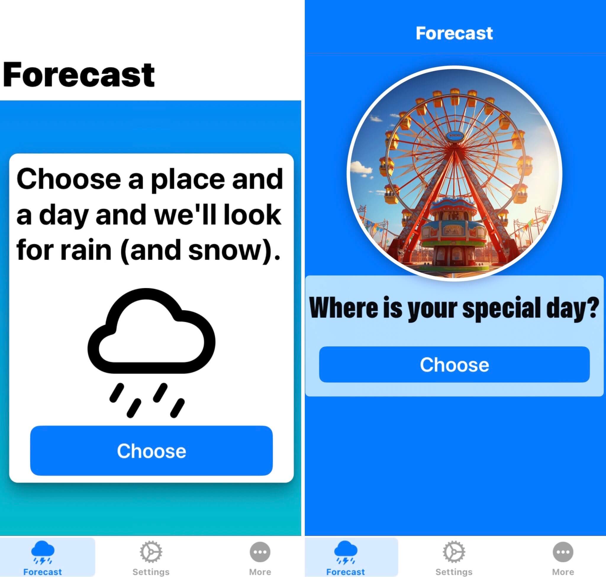
They really weren’t crazy about the wording I had on my initial view when there is no weather being tracked. I have a very unusual weather app in that I focus on a single day, but I didn’t lean into that at all with my boring wording. They suggested asking about a “special day” and I really liked that idea.
The app won’t display full weather images unless you have the pro version and that remains unchanged. However, I extended that restriction to the initial screen. My original thought was that being able to make the screen look nicer would be an enticement to upgrade, but I realized that’s not a great approach because why would you want someone’s first impression of your app to be something ugly? I came up with the idea of incorporating imagery of places and situations that could be negatively affected by the weather. The app will pick one of those random images at launch time. I then took a bunch of ideas from friends and morphed them into this UI. Now this is the kind of first impression I want to make!
Dedication
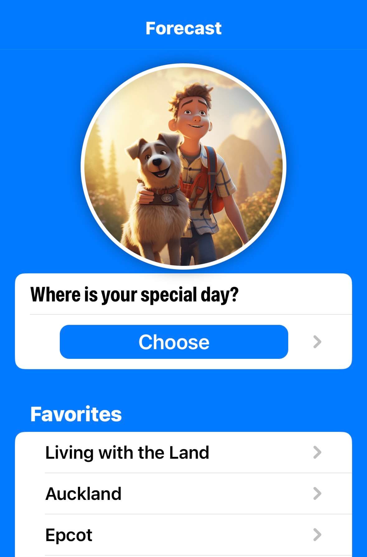
It touched my heart when I learned that Ed Worrell uses my app to plan his walks with his guide dog. This is one of the random images that will appear and is dedicated to Ed and his dog. I made sure to make this screenshot be where you have saved favorite locations. The idea to do that came from Ed!
Forecast View
The initial feedback I got on my forecast View was actually something that has been bothering me for a while. She said that her eye was drawn to the weather image, but then there’s not much relevant data to look at after that without scrolling. I did some compressing and rearranging of items while still making sure that the image was prominently displayed. I like this end result so much better. And how cute is this rainy kitten?
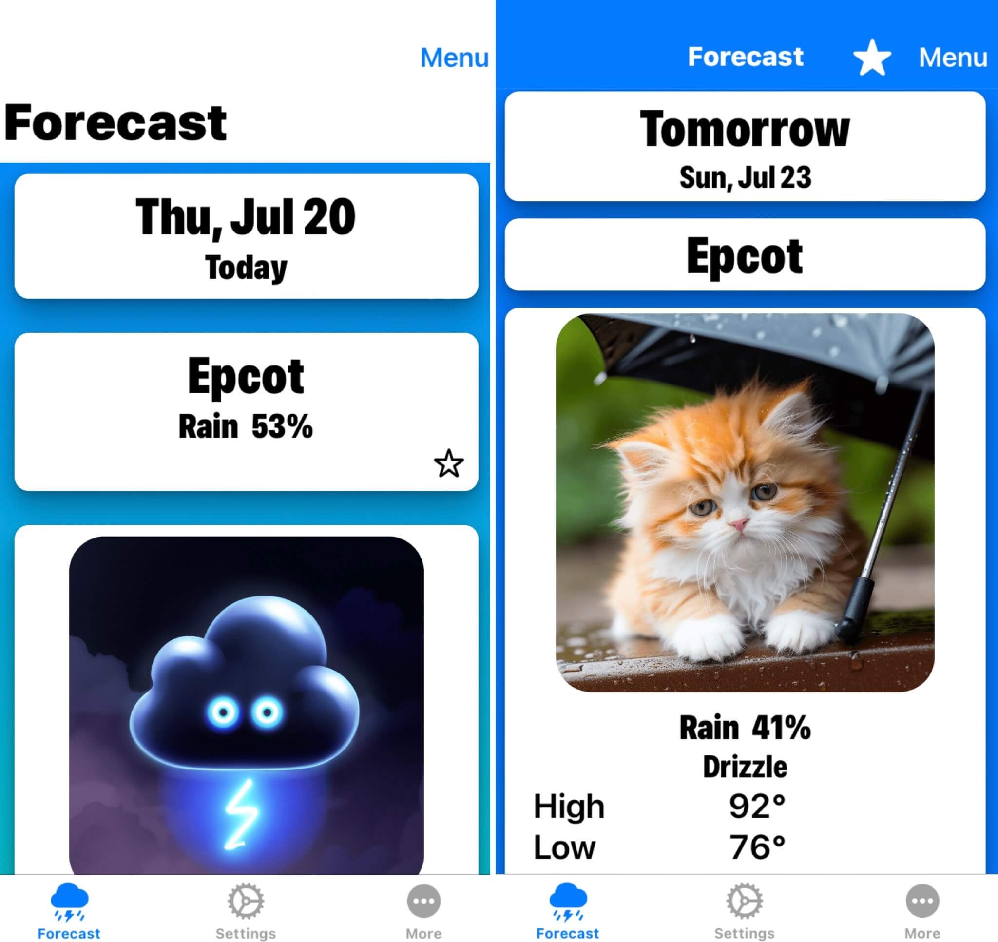
You can also see other changes based on their feedback. The background color now also covers the navigation bar at the top. Another good point they brought up was that how many days left until your special day seems way more important than the date of your special day. So now those two items have been flipped in size at the top of the screen.
Settings
They weren’t a fan of my Settings screen at all and it’s easy to see why. It was a giant jumble of varying controls that made things hard to find. They suggested grouping things into sections. It took some “inspiration” (with permission) from the Settings page of a popular recipe app that rhymes with “Brouton” and changed the Settings page to look like this instead.
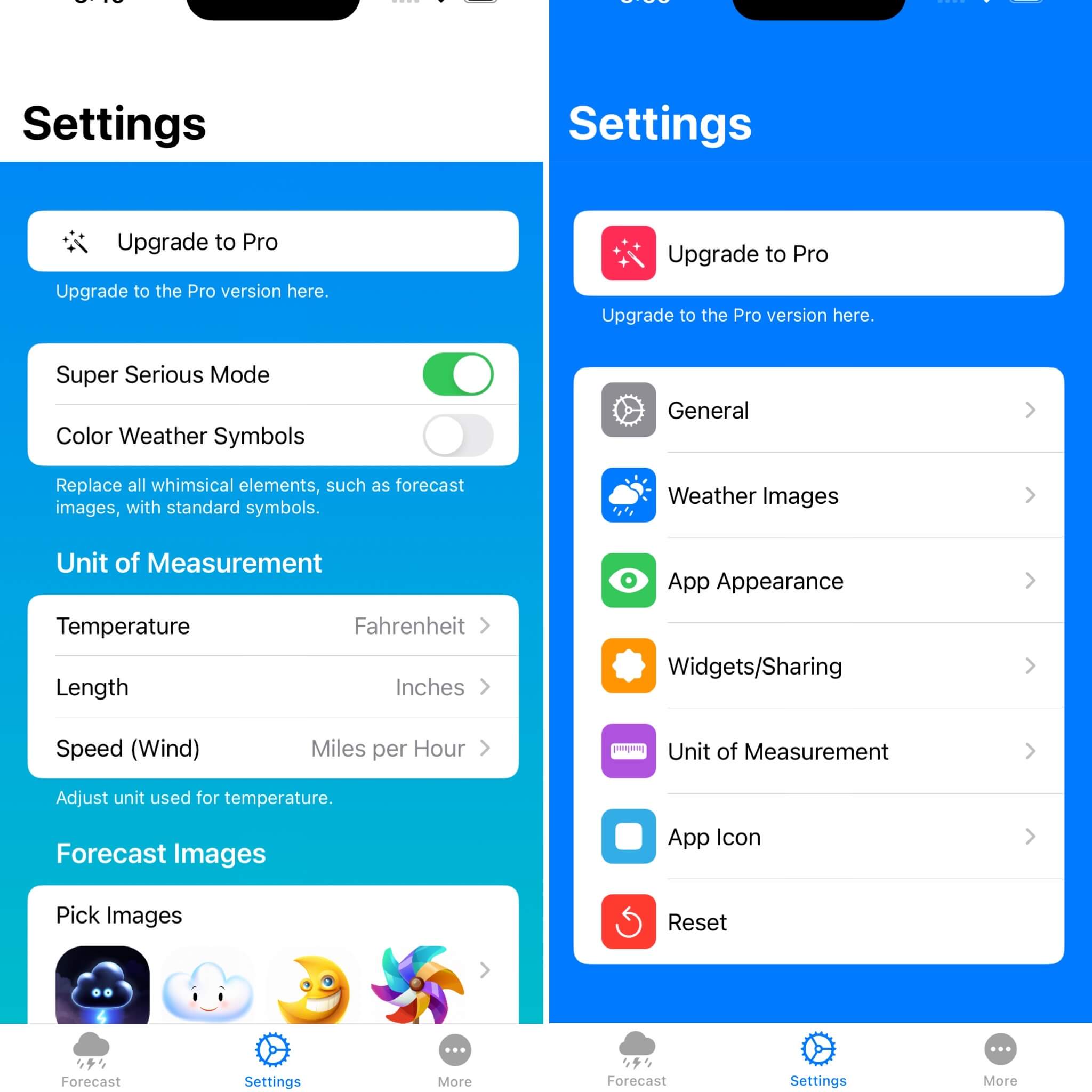
As someone who has to constantly change settings to test various parts of the app it is now so much easier to do so with this organization in place. I couldn’t resist pushing this part out early before redesigning the rest of the user interface.
Paywall
This last suggestion will probably be controversial but it made a decision really easy for me. They did not like how the very first thing my app does after a user installs it is to launch the paywall screen. This was something I’ve been uncomfortable with but I decided to try after reading some advice about this in a Tweet thread when I was still using Twitter. To me it didn’t make sense to buy something before you’ve even tried it but they swore that it was effective. It also felt a little pushy to me. If you do this in your app I’m not speaking negatively about what you’re doing. I just never really felt like it was a good fit for me. Once they gave me this feedback it was an easy decision for me to rip out this logic. I want users to try the app a little before I push a paywall on them.
Images
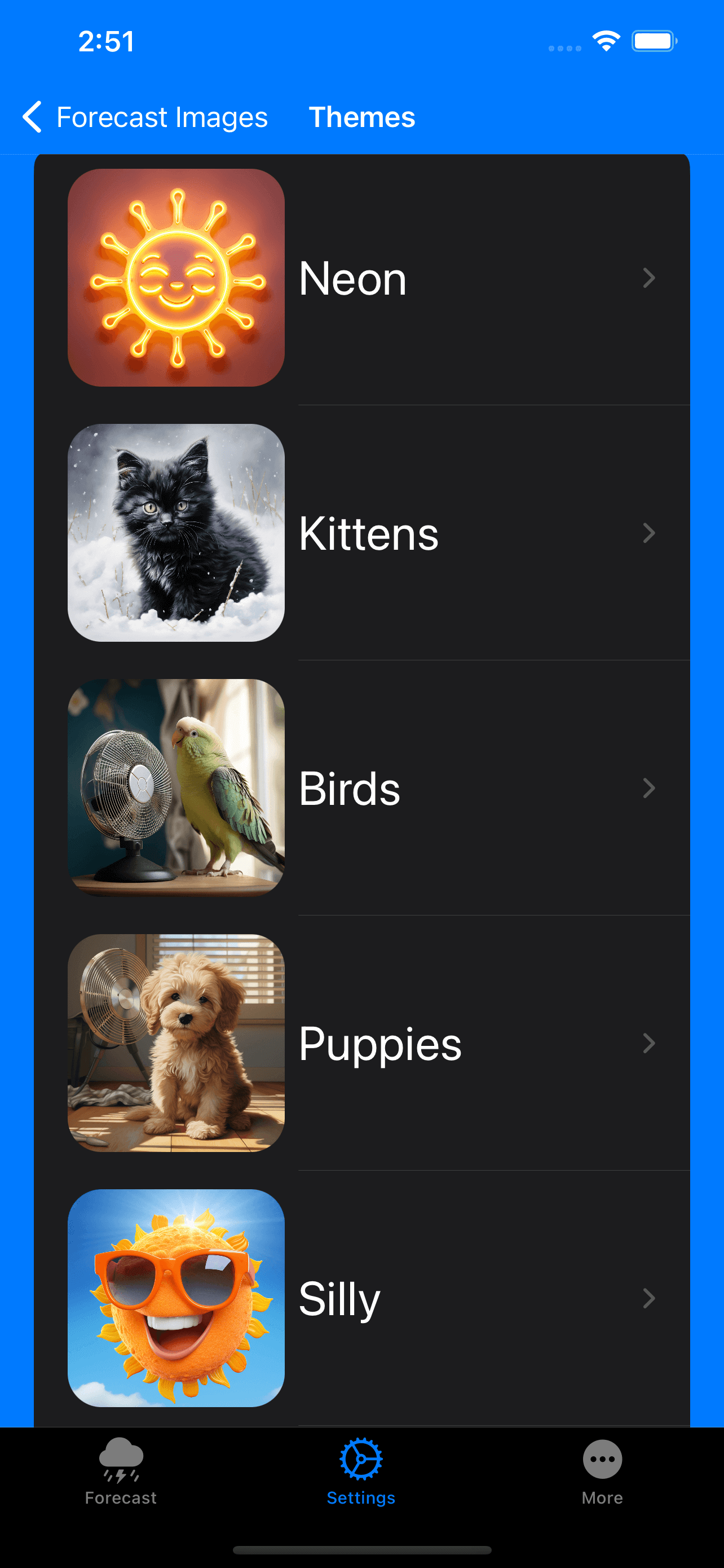
Along with UI changes this upcoming release has so many new weather images that are a drastic jump in quality. I also added the ability to select a theme to quickly change the weather images to a matching style.
Conclusion
I feel really fortunate to have been able to get into a design lab and can’t recommend one enough. When you’ve stared at your app for so long you lose the ability to see it from a fresh perspective. Having experts take a look at your app is priceless.
We’re not allowed to record our sessions and in looking at my notes I didn’t write down the names of the designers that helped me. I wish that I could thank them again and show them how their comments made my app so much better.
Contact
If this post was helpful to you I’d love to hear about it! I’m @MuseumShuffle@mastodon.social on Mastodon and @chriswu.com on Bluesky.
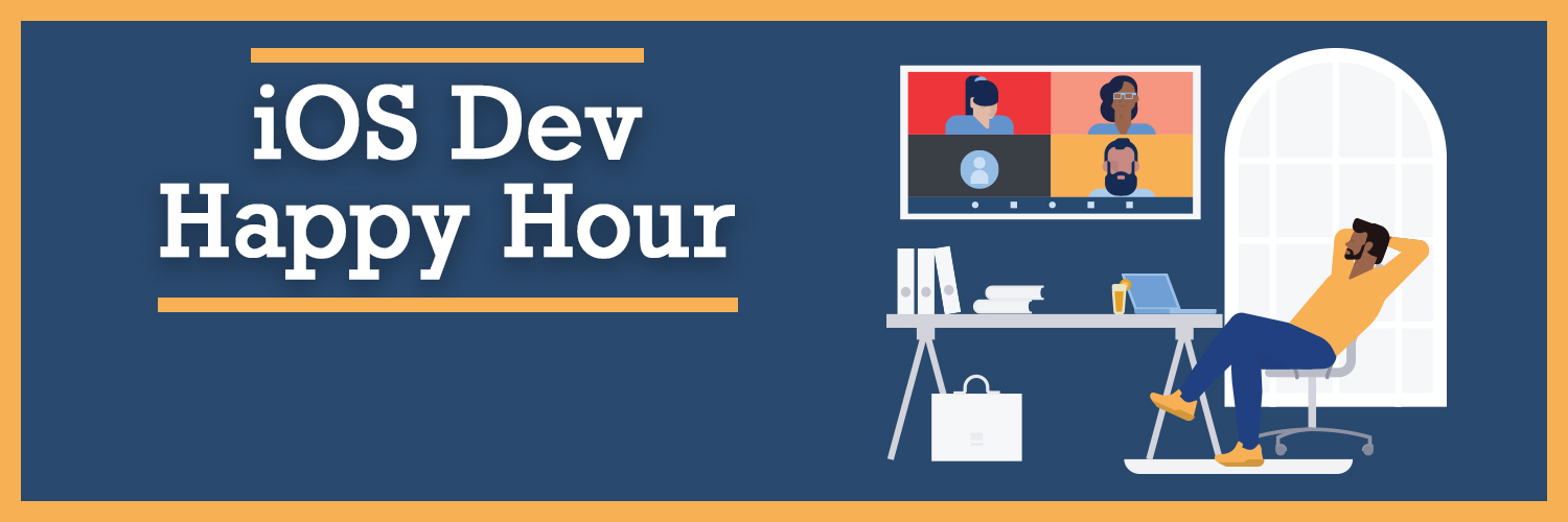
iOS Dev Happy Hour
Also, whether you’re interested in becoming an iOS developer or you’re a veteran of the App Store, iOS Dev Happy Hour is a great place to meet and connect with other iOS Developers. Join us at our monthly event!
Social Media:
- Mastodon - @iosdevhappyhour@mastodon.iosdevhappyhour.com
- Bluesky - @iosdevhappyhour.com
- Threads - @iosdevhappyhour
- Twitter / X / Whatever - @iosdevhappyhour